Color Curves
Color Curves is an app for making unique color palettes that can enhance data visualization and generative art projects. It provides a UI wrapper around the underlying color-curves library, which implements a novel method of generating continuous color palettes.
Example palettes created with Color Curves


Methodology
The HSL Color Space
HSL (hue, saturation, lightness) is an alternative representation of the RGB color model. It was designed to align with the way human vision perceives color-making attributes.
The 3 values that make up an HSL color can be visualized by a color wheel:
- Hue - Rotation around the color wheel, in radians
- Saturation - Distance from the center of the color wheel, usually normalized to [0, 1] or [0%, 100%]
- Lightness - Distance along a secondary axis, usually normalized to [0, 1] or [0%, 100%]

Plotting Curves
Color Curves separates the HSL schema into two distinct parts: Hue-Saturation (HS) and Lightness (L).
Hue-Saturation (HS)
All possible hue and saturation values are projected onto a unit circle, upon which a curve is drawn that defines the H-S values for the palette. The length of the curve will always be normalized to 1, such that the starting point of the curve (represented by a green dot) will map to the starting point of the palette. The end of the curve (red dot) will map to the end of the palette. Values in between are given based on the location of the curve at that point.
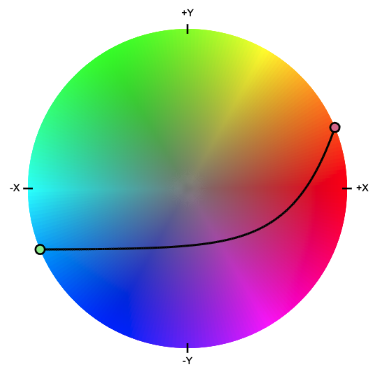
An exponential curve mapped onto the HS space
Lightness (L)
All possible lightness values are projected onto a unit square, upon which a curve is drawn that defines the lightness values for the palette. This works in much the same way as the HS chart, with the exception that it only maps one value to the palette, which is represented by the Y value (height) of the curve. For this reason, the only consideration for the lightness chart is how quickly the curve moves up. Translating the curve along the X-axis only affects the palette if doing so clips a portion of the curve.
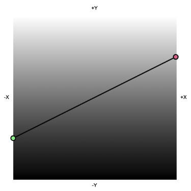
A linear curve mapped onto the L space
The Resulting Palette
The palette produced by the editor combines the input from the HS and L editors. The curves in the examples above make the following palette:

The HS curve and resulting palette start with a saturated blue and move across the purple continuum, finally reaching a saturated orange color. The darkest shade is on the left, and the palette gradually increases in lightness as it moves to the right, mirroring the slope of the L curve.
Commentary
It's empowering to ask "what-if" and then answer your question. I was learning about the HSL space for a different project, but couldn't help admiring the elegance of the color space. I wanted to develop a way to create palettes on top of it and wondered if a curve-based approach would work. It was satisfying to implement the strategy I had in mind and see it in action, even though overall, the resulting color palettes are a little less impactful than I had hoped. I chalk this up to the fact that many of the curves pass through the unsaturated grey center of the H-S unit circle to reach the other side.
Future Work
If I were to pick this back up, I would:
- Add Bezier curves with a better WYSIWYG interface
- Look into adding other color spaces (HCL, CIE)
- Add an equal-luminance mode (equal-luminance is a desirable quality for data visualization)
- Add a "dotted line" feature that performs linear interpolation between two points without sampling the intermediate values along the H-S color wheel